
Janus Press ~Vermont |
Share this page: |
| NMWA: “Van Vliet started Janus Press, presently located in Newark, Vermont. The press embodies the age-old tradition of book making, yet it also experiments with innovative book formats and structures. In addition to the more than 90 artist’s books that Van Vliet has published, she has also created hundreds of drawings, prints, pulp paintings, and broadsides.” Smith College Library, Mortimer Rare Book Room: “Claire Van Vliet is one of America’s preeminent artists of the book, having created some of the 20th-century’s most important fine editions. For decades she has made significant contributions to and innovations in the fields of fine printing, papermaking, bookbinding and printmaking. And as a teacher she has had a profound impact on several generations of aspiring book artists. “In 1955 Van Vliet printed the first book from her Janus Press, now located in the Northeast Kingdom of Vermont. She is known both for her use of traditional techniques, materials, and forms, as well as for innovation in illustration with painted paper pulp and non-adhesive and woven book structures. She also has collaborated with, and mentored, many book artists during the past 50 years, many of whom have gone on to important careers of their own. For her work as a teacher and artist Van Vliet received a “genius grant” from the MacArthur Foundation in 1989; it was the foundation’s first recognition of achievement in the book arts.” |
|
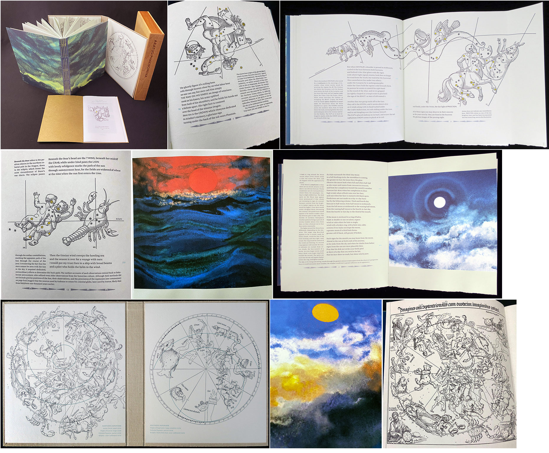
The Phaenomena of Aratus 9.5 x 11.5"; 74 pages. Housed in a maple and birchwood slipcase with a laser cut label on the spine. Cloth-bound chemise lined with Durer's 1515 celestial maps. Long-stitch binding with pulp-painted covers by Katie MacGregor. Includes a 24 page pamphlet of Stanley Lombardo's original Introduction and Notes in a pocket inside the front cover. Printed letterpress by Andrew Miller-Brown on Barcham Green Boxley. Frontispiece of Durer's 1515 northern celestial map. 28 illustrations of the constellations from Caspar Vopel's 1534 woodcuts. 8 original digital prints of weather by Claire Van Vliet based on her pulp paintings. Smaller images throughout the weather commentary in the last half of the book. Numbered. Janus Press: "'ARATUS / PHAENOMENA / SKY SIGNS' [is] translated from the Greek by Stanley Lombardo with commentary for the modern reader by Mark Breen, senior meteorologist and director of the planetarium at the Fairbanks Museum and Planetarium in St Johnsbury Vermont. "This third-century BCE work by Greek poet Aratus describes in verse the constellations, their rotation in the night sky throughout the year, and their uses as a calendar plus solar, lunar, and wind observations for weather forecasting tools for farmers and sailors." Plowboy Press: “Aratus was born in Soli in present day Turkey in about 315 BCE. Educated in Athens, he eventually made his way to the Macedonian court where it is believed he wrote the Phaenomena. It describes in verse the constellations, their rotation in the night sky throughout the year, various other natural signs, and their uses as a calendar and weather forecasting tool for farmers and sailors. For Aratus these sky signs, from the constellation Ursa Major to the smallest mouse tossing straw with its paws, represent a gift from Zeus to guide human endeavor if only we would take notice. “The Phaenomena was enormously popular in its time and afterwards. It inspired many translations, some with a liberal dose of revisions and additions, as well as many commentaries starting in at least the second century BCE.” Introduction: “ARATUS’ ‘Phaenomena’ is a semiological celebration of the sky in 1154 Greek hexameters. The sky has not changed much since the time of its publication (c. 270 B.C.) and it may be that the literary climate today is conducive to the revival of a work in which visual signs – celestial, meteorological and verbal – form the very stuff of poetry.” |
 Click image for more |
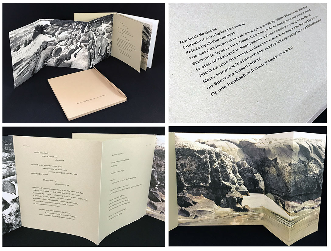
Watermarks 11 x 10"; 5 panel fold out extending to left; 2 panel fold out extending to right; bottom pastedown connects the two foldout images and text. Numbered. Issued in a paper portfolio. Colophon: "The reef at Muriwai is a vitreograph printed by Judith O'Rourke at Littleton Studios in Spruce Pine North Carolina on Somerset paper: the second print is also of Muriwai in New Zealand and was printed digitally on an Epson P600 as was the cover on Barcham Green Renaissance III: the text is set in Neue Hammer Unziale and was printed letterpress by Andrew Miller-Brown on Barcham Green DeWint." "Watermarks" includes two poems by New Zealand poet Riemke Ensing. The book can be paged through, but it also opens out to five feet wide to display vitreographs of Muriwai in New Zealand. Muriwai, wikipedia 01/16/2020: "Muriwai is a coastal community on the west coast of the Auckland Region in the North Island of New Zealand. The black-sand surf beach and surrounding area is a popular recreational area for Aucklanders. … Sand and rock (sedimentary), older volcanic material, with many concretions and layers in the cliff walls. A blowhole plays often. The shore platform is also well jointed, with the main rock type being piha conglomerate. … Muriwai Beach has black sand, caused by the iron content derived from the ancient volcanoes in the area, … The black sand is moved up the west coast of the North Island by longshore drift." Riemke Ensing, poetryarchive.org: "Born in The Netherlands, Riemke Ensing moved to New Zealand in 1951. A distinguished poet, Ensing’s life has also been spent as a tutor at The University of Auckland (NZ), where until recently she was an honorary research fellow, as an anthologist, a visual arts essayist and reviewer, and a leading campaigner for Amnesty International." |
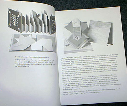
|
Punta del Burro 9.75 x 12" case contains two items "Vallarta Drawings" and a chapbook of corresponding poems. Box covered in Barcham Green Renaissance IV and Twinrocker Black Abaca with maple wooden sides. In slipcase covered with Gruppo Cordenons Bakri paper made by Judi Conant. Signed by poet and artist. Numbered. Vallarta Drawings: 8.5 x 10.5"; 52 pages. Original drawings scanned and then printed with an Epson SureColor P600. Prepared in the computer for polymer plates and printed letterpress by Andrew Miller-Brown. Bound in covers of Canal paper from St. Armand Papeterie in Montreal. Chapbook of edited poems: 10.25 x 6"; 40 pages. Printed on handmade Japanese Kozo Natural in two different makings. Text set in Gill Sans. Printed letterpress by Andrew Miller-Brown. Bound in handmade St Armand linen with handsewn binding. Janus Press: "Punta del Burro… with drawings by Jon Gregg that inspired poems by Kwame Dawes. The poems were handwritten directly on the photo copies images requested by Kwame from Jon. The accompanying chapbook contains the poems set in type. The page numbers of the books are synchronized with each other, though once one gets used to reading the cursive, it is very legible." Colophon: "In 2012, whist at the Vermont Studio Center, Kwame Dawes saw a set of twenty-four Vallarta Drawings VSC Founder Jon Gregg had made in the town of Punta del Burro, outside of Puerto Vallarta, Mexico. He requested and received a set of the photocopies and subsequently wrote poems around the drawings directly on the 11 x 17" sheets. Kwame has described his process in the accompanying chapbook of the edited poems. Kwame Dawes, www.kwamedawes.com/about/ (accessed 11/26/2018): "Born in Ghana in 1962, Kwame Dawes moved to Jamaica in 1971 and spent most of his childhood and early adult life in Jamaica. He is a writer of poetry, fiction, nonfiction, and plays. As a poet, he is profoundly influenced by the rhythms and textures of that lush place, citing in an interview his 'spiritual, intellectual, and emotional engagement with reggae music.' "Kwame Dawes is the author of twenty books of poetry and numerous other books of fiction, criticism, and essays. … He is Glenna Luschei Editor of Prairie Schooner and teaches at the University of Nebraska and the Pacific MFA Program. He is Director of the African Poetry Book Fund and Artistic Director of the Calabash International Literary Festival." Jon Gregg, Brattleboro Community TV, telecast Jan 9, 2017: " Jon Gregg is well-known as the founder and president of the Vermont Studio Center, the largest artist retreat in the United States located in Johnson, VT. In the 33 years Gregg ran VSC he was also actively painting in his studio of the retreat. His paintings utilize Buddhist principles, treating the act of painting as a meditative practice, each resulting piece free of attachment and permanence." |
|
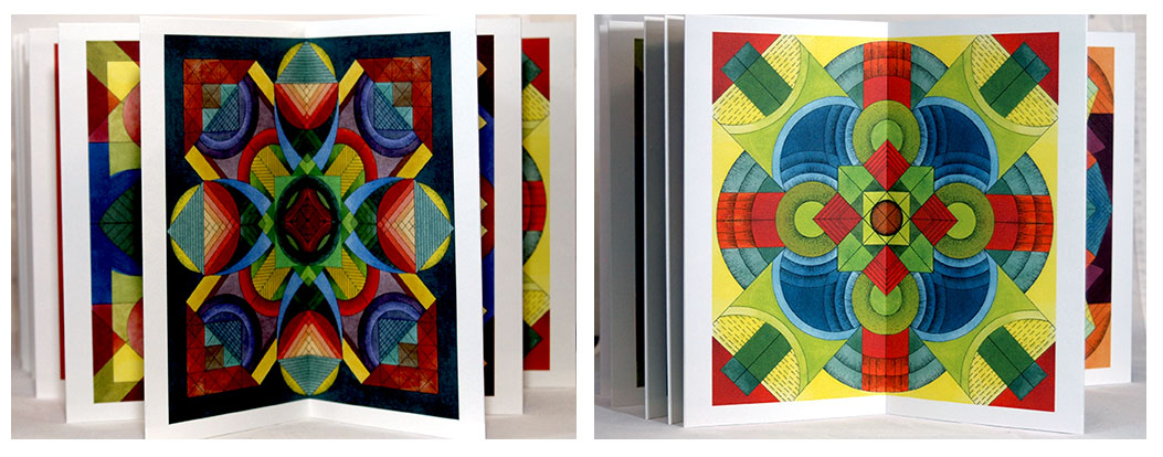
Gameboard / Symmetries 4.5 x 8.5"; 25 double folds. Double-sided accordion. 25 gameboards printed on Strathmore Cotton paper with an Epson Sure Color P600 using Ultra Chrome HD ink. Colophon printed on Barcham Green Martian Red paper. Chemise covered in the same texture and colour of paper from Ecological Fibers as was used for the original Scrabble boxes with a slipcase of the same antique finish. Bound in Barcham Green India paper. Numbered. Introduction: "'Gameboard/Symmetries' was inspired by old and antique board games such as Parcheesi, Sorry! and Chinese checkers. Ellen Dorn Levitt began each symmetrical design on paper by drawing a light pencil grid that divided the picture plan horizontally, vertically, and diagonally. Then using only compass, ruler, and pencil, she further worked her design out from the center of the composition. Once the design structure was finished, she went back over the lines with a technical pen filled with insoluble ink. After erasing all of the penciled design and grid lines, she added layers of transparent acrylic ink to facing parts of the composition in symmetrical patterns. For this edition Ellen chose a quadrant from each of the original Gameboards and scanned it into the computer to further work on; the quarter was then used to create the final image for printing digitally. Like mandala designs or the views seen through a kaleidoscope, the 'Gameboard/Symmetries' series has no right way up." Claire Van Vliet: "…the project of twenty-five images, all variations of the same basic structure. The leporello binding allowed us to gather the leaf motif on one side and the ladders on the other, though there is quite a lot of crossover." Colophon: "Gameboard/Symmetries' was designed and executed by Linda Lembke and Claire Van Vliet to honour the work of Ellen Dorn Levitt (1947-2014), our good friend and collaborator in bookmaking over many productive years." |
 Click image for more |
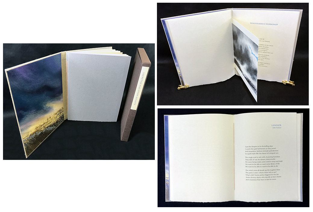
Lucretius and Other Sonnets 10.25 X 7.75"; 33 leaves printed on the recto only plus 3 smaller image pages. Lithographs and digital prints by Claire Van Vliet printed on Zerkall Butten Papier. Text set in 12 point Diotima and printed by Andrew Miller-Brown on Barcham Green Windsor. Binding developed by Carolee Campbell for Ninja Press. Bound in Light brown cloth boards with image by Van Vliet as front pastedown. Interior cover of gray paper handmade by Kathryn Lipke and Van Vliet. Numbered. In slipcase of Gruppo Cordenons Bakri cover paper from Italy (no longer made). Janus Press: "WR Johnson is a much published classicist with works on Horace, Cicero and Lucretius among others. These sonnets have the classicist's long perspective on the ups and downs of civilizations, including ours." W.R. Johnson is John Matthews Manly Professor of Classics and Comparative literature, Emeritus, at the University of Chicago, USA. He is the author of Darkness Visible and Horace and the Dialectic of Freedom. |
 Click image for more |
| The Silences Between (moeraki conversations) By Keri Hulme Newark, Vermont: Janus Press, 2016. Edition of 125. 10.5 x 11.5" box containing "maori glossary and colophon" pamphlet (6.25 x 8"; 8 pages with a trifold pull out) and "The Silences Between" book (9.5 x 10"; 114 pages). Map printed on lid interior. Colophon: "The frontispiece is a vitreograph of a Moeraki Boulder by Claire Van Vliet made at the Littleton Studio in Spruce Pine North Carolina and printed intaglio by Judith O'Rourke on Stonehenge paper. The images in the text are original digital prints made by Claire Van Vliet in Photoshop and printed on Barcham Green Chatham Flaxen with an Epson SureColor P600 at the Janus Press in Newark Vermont. The paper for the book covers was pulp painted with Katie MacGregor. The map was clarified by David Higgins, scanned by Ellen Dorn Levitt, prepared by Claire van Vliet in Photoshop and printed letterpress from polymer plates by Andrew Miller-Brown on calendered Barcham Green Sandwich. The text is Helvetica Neue and Plantin with Hammer Uncial titles printed from polymer plates by Andrew Miller-Brown at Janus on handmade papers: gold and denim black cover from the St Armand Paperterie Montreal Canada; and Boxley, Cambersand, DeWint, Charles I, Finale, Hayle, Sandwich and Cairo from Barcham Green in Maidstone Kent. The box is covered with Barcham Green Nefertiti with the moon spine inset being Royal Watercolour Society paper painted with acrylic pearlescence; the foredge paper on the lid is St Armand natural linen decorated with grey and white acrylic paste; the wood sides were made by Jack Sumberg using maple for the lid and tamarack for the base; and slipcases made by Mary Richardson. The Glossary of Maori was prepared by the author." Slipcased. Signed and numbered by Claire Van Vliet. Signed by the poet. Poems by New Zealand writer Keri Hulme, whose novel, The Bone People, won the Mann Booker Prize in 1985. Janus Press: "This has been the longest project for the Janus Press as the contract with Keri was signed in February of 1996. It is also one of the biggest books (114 pages) the press has printed; books do seem to be improved by delay as the designing process is continuous; this one has ... added a slipcase which will make it easier to shelve. … "The strip binding was once more the solution allowing the inclusion of different sizes of sheets, plus the Conversations sections seemed best served with a variety of papers. The images can be popped forward for a three dimensional wagon wheel display." $2,500 (Last 2 copies) |
 Click image for more |
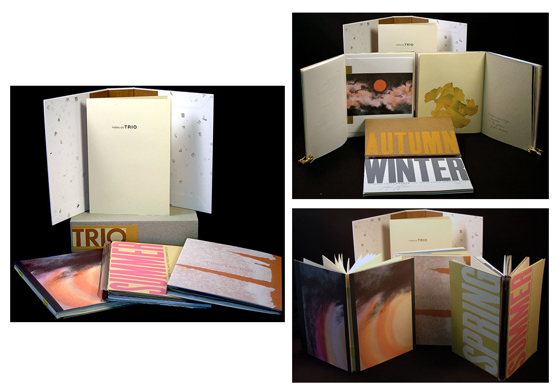
| TRIO By Leland Kinsey, Judy Haswell, Karen Hesse Newark, Vermont: Janus Press, 2015. Each book edition of 150 with 115 issued in this set. Slipcase 8.5 x 6.5 x 2.25" housing three volumes. Each volume 8 x 6"; 164 pages (42, 42, 80). Exposed spines. In a chemise covered in Parsons Cotton Confetti. Slipcase covered in Parsons Green Cotton. Signed by the poets. Prospectus: "The three poetry books are ECLIPSES by Leland Kinsey, IT WAS LIKE THAT by Judy Haswell and COSMOS by Karen Hesse. ...COSMOS has poems about both solar and lunar eclipses and also has a set of diagrams that explain them. IT WAS LIKE THAT has three long poems printed ... with twelve short ones in the author's handwriting. This book contains many interesting hand made papers. ECLIPSES has long poems as a center piece of each of the four seasons sections accompanied by haiku appropriate to the season. Each season is a separate pamphlet attached to an acrylic tube enabling the book to be read circling continuously. This is another of the ongoing books that celebrate the Seasons." Notes: "The books themselves are a celebration of the wide palette of hand made papers that have accumulated at the press over the years and are listed in the colophons." $450 |
 Click image for more |
Waste Incant 7.75 x 11.5"; 22 pages. In plexiglas slipcase. Plastics used include the acrylic slipcase and illusion polycarbonate and flexible vinyl from Rowland Technologies. Papers: Barcham Green Cambers and Cairo from Hayle Mill. Printed in black and silver. Johanknecht’s response to the storage of nuclear waste in plastics. This book is a sequel to Johanknecht’s Hermetic Waste (about Chernobyl), published in 1986. Artist's statement: "The format and materials of this book reference Hermetic Waste (Gefn Press, 1986) which was completed the summer following the Chernobyl disaster. The collagraph prints in Hermetic Waste were derived from alchemical engravings — here the calligraphic line drawings are derived from science illustrations in children's text books (Science from the Beginning edited by Hampson and Evans, 1962). Redrawn and merging, the pictorial 'facts' depict a disrupted 'nature.' "Poetic texts sit inside the imagery, functioning as an integrated caption. They describe processes by which toxic material enters into the environment. The back of each page lists hazardous wastes. "Plastic interleaving features in both books, referencing materials used in the storage of waste. (How little has changed in twenty years.)" "The book, in its acrylic case, is a statement about the storage of nuclear waste in plastic. The line drawings are derived from children's textbooks, redrawn to show a disrupted nature. The toxic wastes, listed partially alphabetically, are printed on both sides of the embossed paper, each page separated by a plastic sheet. The unstable and hence inappropriate and hazardous use of plastic to contain toxic waste is emphasized by the diverse deformations of each of the plastic sheets. "How fascinating that the book is immaculate and glamorous while its topic - water - implies what's dirty and distasteful. The ironic disjunction dramatizes the tension between the allure of easy labor, magical communications and other seductions of our high tech culture and the tarnished other side of the coin, deadly byproducts with tenacious half-lives. The book uses the very products it condemns. We can't do without it, can we?" [Beyond the Text: Artists' Books from the Collection of Robert J. Ruben by Yvonne Korshak and Robert J. Ruben] |
|
| Janus Press Out of print and Sold titles: | |
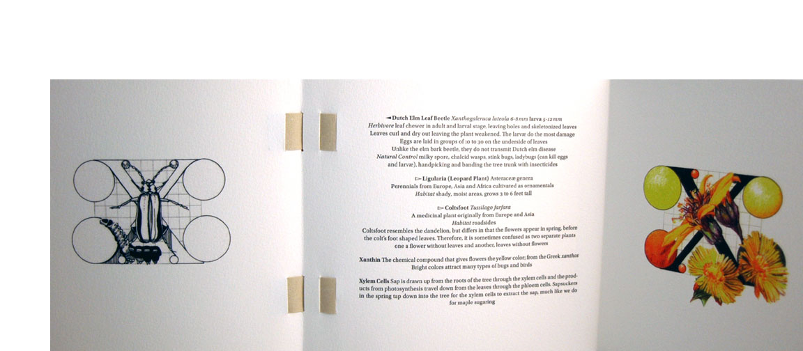
| ABC Of Bugs and Plants in a Northern Garden By PJudy Fairclough Sgantas Newark, Vermont: Janus Press, 2012. Edition of 120. 7.5 x 7.375 x 2.5"; 82 pages, including 26 trifold pages. Drawings digitally scanned from ink, graphite, and colored pencil originals. Printing with Durabright Ultra Inks on an Epson Workforce 1100. Text letterpress printed from polymer plates on a Vandercook SP20. Printed on mouldmade Arches 90lb Cover cotton paper. Bound in Barcham 140lb DeWint handmade watercolor paper. Woven strip binding designed by Claire Van Vliet. Laid in box tray covered in Scholco and Seta cloths and lined with St. Armand paper. Box exterior cover in natural linen. Title label printed on ochre paper mounted on paste paper. A collaboration between Vermonters Claire Van Vliet, proprietor of Janus Press, and Judy Fairclough Sgantas, an artist and gardener. This work is a double alphabet book, with classical Roman letter forms entwined with plant life and insects. For each letter of the alphabet a black-and-white image faces a second colored image, revealed by opening an opposing folded leaf, with text positioned on a center panel between the complementary images. The content is about garden pests – what attracts or repels them – and a plant’s defenses. The text gives definitions of the insects for that letter including both common and Latin names. Information ranges from "common habitat" to "natural control." Note on the Letters: "The geometrical formation of Roman capitals was inspired by Renaissance interest in the monumental inscriptions of classical antiquity. … The earliest example of a work to show diagrams of letters formed by geometrical means is a 1463 manuscript by Felice Feliciano of Verona. ... In 1509 the first printed edition of Pacioli's De Divina Proportione appeared in Venice, including an appendix on geometrical letterforms with the different circle sizes that determine the curves of the letters and serifs. ... Different designers divided the basic square into grids of nine, ten, and twelve divisions to help determine the shape and proportion of the letters. The title page ABC is from Pacioli's drawings of the alphabet in the appendix of De Divina Proportione. " (Out of Print) |
 Click image for more |
Aunt Sallie's Lament. Altered. 8.25 x 11" (irregular shape) fitted into a 9 x 12" box. Originally published in an edition of 150. "An inspirational story of a Southern quilter printed on colored, uniquely shaped pages that create a layered effect, mimicking the patterns of a quilt, gathering words as stitches, gazing back to a moment lost but not forgotten, to a love burned deep." This new production of Aunt Sallie's Lament by Claire Van Vliet has been altered by adding new color & patterned swatches of paper to brighten the pages and to quilt the cut pages. Laid in fitted box covered with lined with several patterned fabrics as well as covered in patterned fabric. |
|
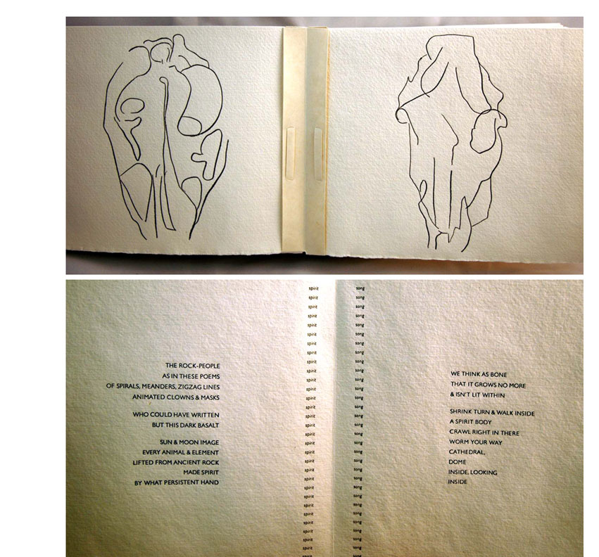
| Bone Songs By Clifford Burke Newark, Vermont: Janus Press, 1992. Edition of 150. 10.25 x 8 x 2"; 40 French-folded unnumbered pages including covers. Eighteen polymer relief prints from drawings by Ruth Fine. Poems set in 10 pt Gill Sans Light caps. Colophon set in 8 pt italic caps. Gutter repeat columns set in 8 pt italic lower case. Text printed damp from magnesium plates in black on Barcham Green Royal Watercolour Society paper. Completely non-adhesive binding using MacGregor-Vinzani calendered ivory abaca paper. Housed in a two-sided slipcase of Barcham Green Renaissance paper and drum vellum. Califia Books: "Poems written by Clifford Burke in response to line drawings by Ruth Fine. In 1990, Fine sent her drawings of animal skulls to Burke and asked him to write poems to go with them. Text and image transport us into the realm of spirit and nature, reminded of Native American lore as we would be by bleached skulls in a dry desert – a liminal world of spirit and earth. The construction and presentation of this book are exceptional. "Each deckled sheet was printed whole with two drawings and two blocks of text, then folded in four and bound together with paper strips for alternating spreads of text and image. The paper stripping forms a spine at the center of the illustrated pairs of pages. The two word titles of the poems – 'Fire Song,' 'Wind Song,' 'Root Song' – straddle the fold, printed in a tiny point size and repeated in vertical columns, an echo that anchors the page without overwhelming it. Thus, the book opens like a series of spread wings. Letterpress in a delicate, capitalized san serif font that reflects the quality of the line drawings. Printed on thick, handmade paper the color of sun-bleached bones. Housed in a two-sided slipcase made of folded paper and folded skin the texture of a drum." (SOLD) |
 Click image for more |
Deep in the Territory 9.75 x 8.75 x 1.5"; 26 unnumbered pages, including covers. Letterpress printed. Composed of a variety of hand- and machine-made papers; minimal adhesive. Thirteen collages (six double-sided pages plus the cover) of woven and interlocking colored papers. Handmade papers in quilts and binding: Barcham Green, Shadwell, Cal-ling, MacGregor-Vinzani, Degener, Twinrocker, Janus. Titles handset in 30 pt Tuscan and 14 pt Berthold Walbaum; text handset in 12 pt Berthold Walbaum. Printed on dry calendered Barcham Green Sandwich paper. Housed in a cloth-covered clamshell box with title label on spine. Box covered in Waverly upholstery gingham with stays and interior in two indigo calicos. A quart-size ziplock bag of paper remnants laid in. Binding structure & design by Claire Van Vliet. Califia Books: "Third in a series of quilt books by the poet and the press, this edition also echoes, in its design, Janus' Beauty in Use by Sandra McPherson. The thirteen quilts, which bring to life the eleven poems herein, are built from interlocking strips and shapes of paper to form double-sided quilt squares. But, while book artist Claire Van Vliet's intricate and sumptuous delivery may draw us at first visually into the book, Kaufman's quiet, carefully rendered verse stands at its heart. Kaufman, a collector of fine quilts, elevates the ordinary through close observation to the arts and artifacts of life. Her attention to detail, as she stitches together a poem word by word, reveals a fascination with language and object that echoes Van Vliet's equal delight in the interplay of materials – shape, paper, text. Illustrative quilts range from the geometrically spare to one that flaunts convention." The Janus Press - Fifty Years: "Deep in the Territory inspired by plainswomen's quilts. ... There is a recto/verso structure for the quilt pages, and the two sides vary radically in most instances, in both hue and in format. Looking at one side you have no idea at all what you will see when you turn the page. ... "Two poems in Deep in the Territory, 'Old Quilts' and 'Pandora's Box' were featured on the eponymous broadside Van Vliet completed in 1989 and 1991 respectively. ... published with a bag of paper cuttings from the various sheets used for the guilt pages; these were included with the volumes in their clamshell boxes, enabling the purchasers to examine the beautiful papers themselves more closely and in isolation. As Van Vliet explained it: 'The scraps just seemed too nice to throw away.'" |
  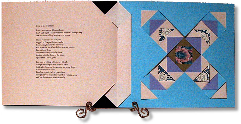 Click image for more |
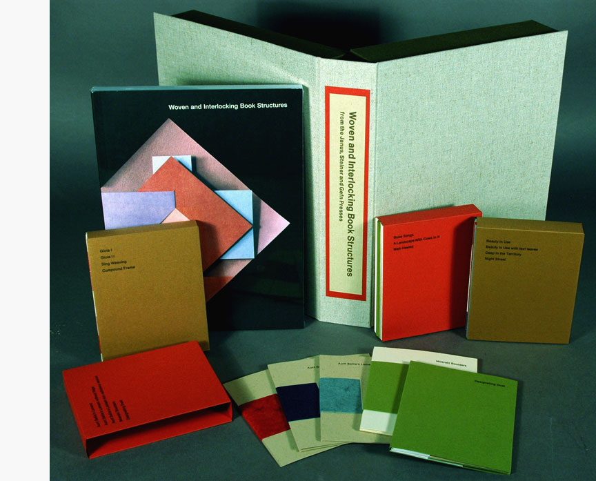
Deluxe edition: Woven and Interlocking Book Structures from the Janus, Steiner and Gefn Presses 8.5 x 11" box holding models. Cloth covered clamshell boxes made by Judi Conant and Mary Richardson in Maidstone, Vermont. Trade edition laid-in. Signed by Claire Van Vliet. Using the instructions from the book “Woven and interlocking Book Structures” Audrey Holden, assistant to Claire Van Vliet at Janus Press, created models of the books. |
 Click image to enlarge |
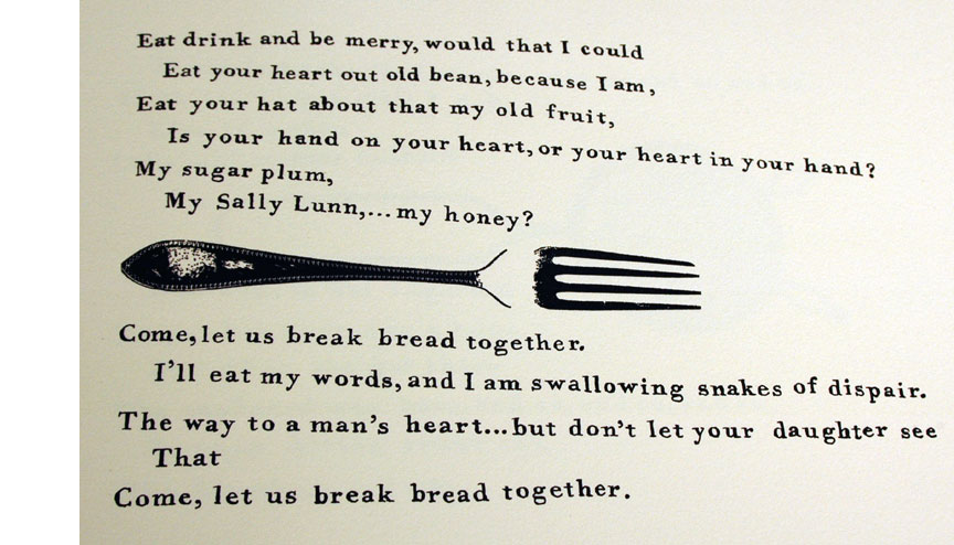
Eat Book Photo offset images in sepia of various foods and eating utensils. Hand lettered printed offset as well. Bound in split boards with vellum spine. Wrapped in a linen napkin. Boards plastered with acrylic and wrapped in a rumpled linen napkin. 26 pages. In conjunction with Gefn Press, this long poem by Katharine Meynell, is a satire on nursery rhymes. A sardonic poem with six sepia duotone still lifes of cherries, sausages, and white bread, made in collaboration with Susan Johanknecht who lettered the text, made eight reliefs of various kitchen utensils, and designed the binding. With recipes written out by Meynell. |
|
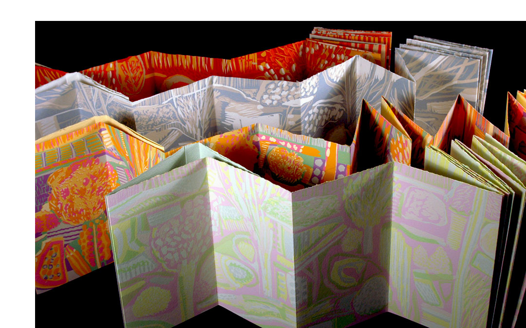
| Four Months / Four Seasons By Ruth Fine Newark, Vermont: Janus Press, 2010. Edition of 110. Four accordion books, each 5 x 8.5 x 3.5" and 14 pages plus a folder-like pamphlet with text on both endpages and one 2-leaf pullout. The accordion books contain reduction linocuts by Ruth Fine. October is bound in Barcham Green handmade paper wraps, April and July with papers specially made by Katie MacGregor. All housed in wooden slipcase made of Baltic birch and poplar. Four Months / Four Seasons is the first in a series on the seasons by various artists. It contains four books - January, April, July, and October - plus a pamphlet describing the reduction linocut process. The pamphlet pullout shows the initial state of the seventh opening in October. Excerpt from pamphlet: "Each of these four books is printed from seven carved linoleum blocks onto multiple sheets of paper. The sheets subsequently are attached to each other and folded to create seven accordion openings that together form a panorama. "All sections of the seven-part image are made by a reduction linoleum cut process. This method requires that each section is partially cut from the block which is then printed, then cut again and printed again, multiple times. "Following each recutting of the seven individual blocks, the newly printed ink layer adds marks and shapes to the final panorama as it maintains those already printed." (SOLD) |
|
Gone 7.5 x 11.25 x .75"; 46 pages. Signed on colophon by Van Vliet and McCulloch-Lovell. Colophon: "The text is set on the computer in 11pt Myrial Pro Italic with titles in Condensed 30 pt. Myrial Pro was designed by Robert Slimbach and Carol Twombly for Adobe Systems. Polymer plates were made at Boxcar Press and printed by Andrew Miller-Brown at the Janus Press on Richard de Bas Apta that was handmade at Hayle Mill in Maidstone, Kent, England. "Two-color lithograph was drawn on the stone by Claire Van Vliet and printed by Eystein Hanche Olsen on Rives BFK in the lithographic workshops at SKHS in Oslo Norway. "The book was long stitched into a Rowlux vinyl moiré cover by Audrey Holden. Slipcase is covered with calendered Royal Watercolour Society paper made by Barcham Green at Hayle Mill." Twenty-one quietly perceptive and reflective poems, filled with close observation about a life lived in concert with the natural. Van Vliet's lithograph of sky and copse and gray-white field, glimpsed through vinyl moiré cover, is an apt reflection of the spirit of the collection – spare without begin bleak, at once solid and in flux. Claire Van Vliet: "Many of the poems in GONE are seasonal though it is not specifically a part of the series [a series of artist and writer responses to the seasonal round of the year]. GONE is a return to poetry publishing; the last poetry book was Alan Loney's RISE in 2003 which surprised us by being so long a pause." |
 Click image for more |
The Gospel of Mary 10 x 11.5 x 1.5"; 44 pages. The center piece is a pop up representing the journey of the soul — “upward from its bondage to the flesh and the lower world to its liberation in the higher celestial realm” (p. 15) — on a base sheet that was pulp painted by the author and Katie MacGregor; they also made the cloud cover sheets. The binding is a further development of the woven-strip binding used in Rise (Janus Press, 2003) and is made with Barcham Green Cairo, a pure linen sheet. The clamshell box has stays of Baltic birch and is lined with paste-patterned DeWint with DeWint drummed on the cover. Translated from the Greek with commentaries by Rosemary Radford Ruether printed in Amercican Uncial with initials based on Victor Hammer's titling, Prisma and Plantin on calendered Barcham Green Boxley with decorations based on Jay Hambidge's Dynamic Symmmetry, the Greek Vase. Rosemary Radford Ruether, noted Christian feminist theologian, begins her Introduction thus: “The Gospel of Mary is a fragment of a Gnostic gospel of earth second century Christianity that focuses on Mary Magdalene as the ‘beloved disciple’ of Christ who especially understands his message and conveys her understanding of this to the male disciples. It is part of a larger literature of early Christianity (first to third centuries) in which Mary Magdalene plays a leading role as a disciple of the Lord.” |
 Click image for more |
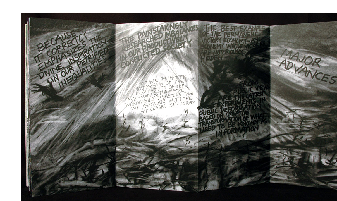
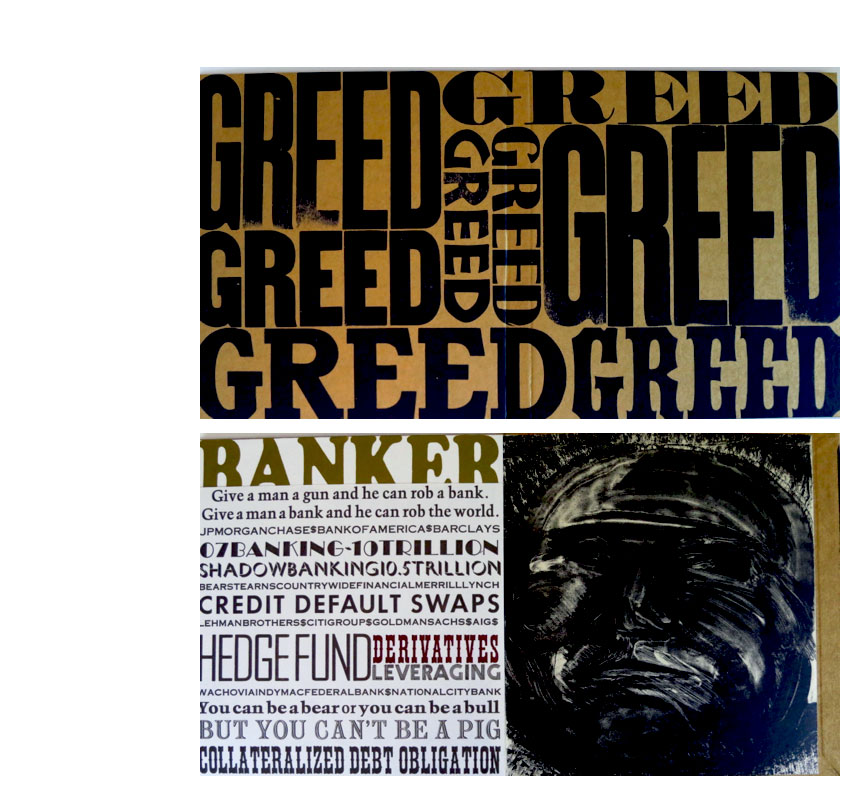
| GREED Lithographs by Claire Van Vliet Newark, Vermont: Janus Press, 2013. Edition of 150. 6.5 x 7"; accordion fold with 8 panels, 4 of them fold-down pages. Four double-spreads, alternating fold-down text in a variety of types and colors on left with a lithograph on the right. Lithographs printed by Eystein Hanche-Olsen in SKHS in Oslo on Zerkall Butten paper. Text handset and printed letterpress. Bound in Gold Elephant Hide paper printed with wood type in black. Slipcased. Signed and numbered by the artist. Candace Page, Burlington Free Press, Meet Claire Van Vliet: A paper pioneer in the Northeast Kingdom: "If aesthetic choices guide Van Vliet’s choice of book and landscape subjects, deep political convictions play a role as well, from editions of Kafka early in her career to her current project. "Van Vliet picks up dummy of GREED, a slim volume that will sit inside a glittery cover of gold paper. It opens like an accordion to display four Van Vliet black-and-white lithographs of distorted faces: A banker, a lobbyist, a newscaster, she says, 'and this one on the end, the sap, John Q. Public, us.' "'For ease slayeth the foolish and the prosperity of fools destroyeth them," she reads from Proverbs, one of the quotations she is assembling to serve as the book’s text. “'That’s where we are, that puts it in a nutshell, where we have been going ever since Ronald Reagan got elected,' she says. "But while she talks about these sweeping political ideas, her fingers are busy, folding and unfolding the book, trying to make it stand erect for display, feeling the edges of the pages. "The word 'greed' will be printed multiple times on the cover in heavy, unevenly inked type, as though it were printed contemptuously, by some greedy person with no respect for the written word. The paper is not handmade — that would be too good for the book. Instead it is 'slick, nasty machine-made paper,' she says. The edges of the gold cover will be sharp 'because greed is not a comfortable subject.' "Van Vliet drew the lithographs and printed 125 copies of each for a book project in 1973 — then rejected them as inappropriate for the text. She put them away for 40 years. ... "The gold paper, too, had been stockpiled for decades ('I’m a paper addict,' Van Vliet says) until Holden, her assistant, remembered it and suggested its gilded gleam would be right for a book about greed. "Van Vliet says her political beliefs were shaped when she was a student during the McCarthy era of the early 1950s. The witch hunt for Communist sympathizers struck home when a fellow foreign student was falsely denounced to authorities. She has been suspicious of the powerful ever since. "But the immediate inspiration for GREED, she says, was not just 'frustration with where the world is going' but the arrival of wind energy developers in the Northeast Kingdom. "A New Hampshire company, Eolian Renewable Energy, came to Newark and neighboring communities in March with plans to erect wind measuring towers, likely to be followed by a wind development of up to 35 ridgeline turbines." (Out of Print) |
Click image to enlarge
|
Helios
|
 Click image for more |
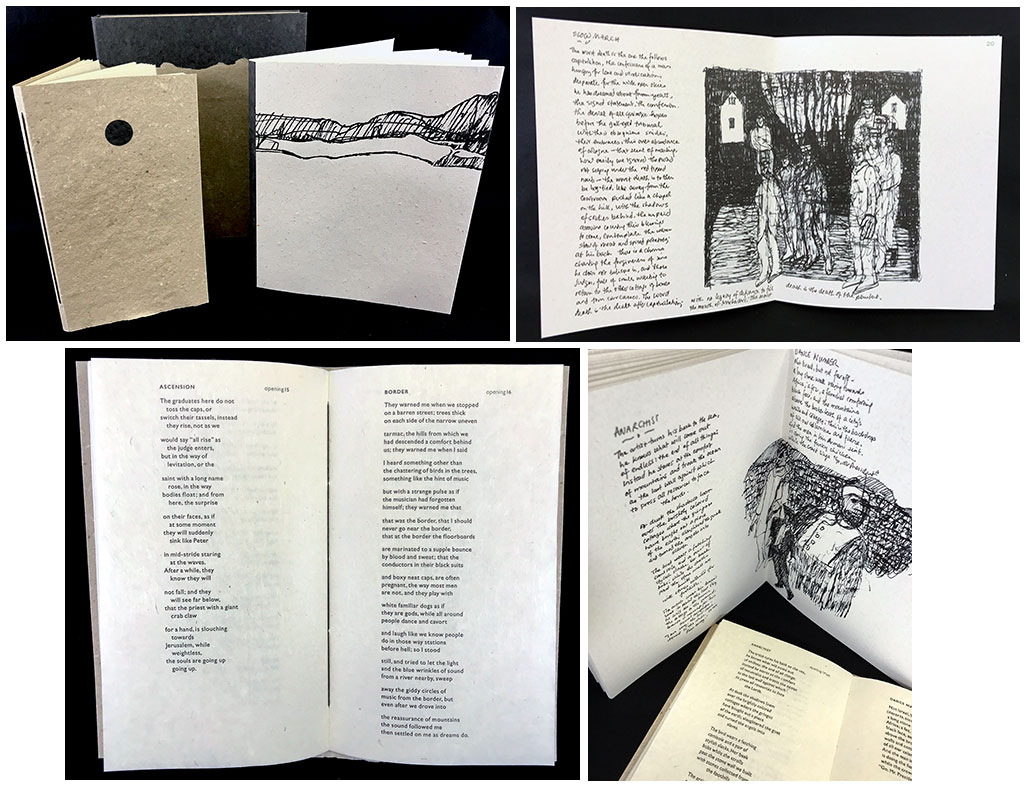
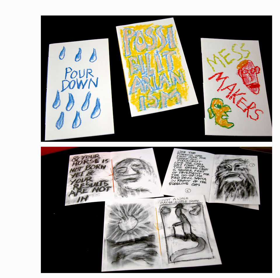
| TATATA By Peter Schumann Newark, Vermont: Janus Press, 2011. Edition of 120. 10.25 x 10.875 x 1.75"; 46 pages. 24 one sheet chapbooks. Charcoal-and-ink drawings scanned using a Xerox Docucolor 700 on Mohawk Superfine eggshell white paper. Crayon cover drawings scanned and printed using an Epson Stylus NX515 on Mohawk Via cream linen. Display pocket panels Fabriana Milliana Ingres. Housed in triptych constructed cloth covered case with paper title on spine. In paper slipcase with the paper title on the spine. Janus Press: "Another publication with Peter Schumann of the Bread and Puppet Theater, TATATA. The twenty-four booklets are a group he drew for Christmas 2009 in the spirit and tradition of Hispanic Cordells. These are chapbooks made from one sheet of paper folded into eight pages plus a cover. The are hawked by poets in Latin American marketplaces strung up pinned on lines like laundry or arrayed on trays similar to those that were carried by cigarette girls. The subjects traditionally cover a variety of subjects as do Peter's: political, tales, ruminations, admonitions, kids' stories and even the weather." TATATA chapbooks: Mess Makers; Milk & Honey; Man - Carrot; You Man; RR; People Who; Possibilitarianism; Birdism; University; Under; Notebook with Iliad; Unreadiness; Pour Down; Foggy Morning; Life; We Must; If you; Helios; Access; DADA; The Hen; The TATATA; Great Wolf Theory; 2 Old Gods. The American Folklife Center: "Literatura de cordel, literally "string literature," refers to small popular books or chapbooks, predominantly from northeastern Brazil. They were often suspended from cords or strings, hung across marketplace stalls belonging to local poets during the late 19th and 20th centuries. Today, cordel chapbooks are still sold and performed on street corners and in markets throughout Brazil, but are more readily circulated through the Internet. Literatura de cordel (sometimes known colloquially simply as "cordel") is a complex and vibrant expressive form that continues to reflect the popular voice of the Brazilian people." (Out of Print) |
|
Woven and Interlocking Book Structures from the Janus, Steiner and Gefn Presses 7.5 x 10"; 142 pages. In black wrappers, woven structure illustration on front. Step-by-step instructions for making 4 x 5 inch models of structures developed for editions at the Janus (United States), Steiner (Australia) and Gefn (England) presses. Includes "multitudes" of instructional diagrams drawn by Claire Van Vliet and Elizabeth Steiner.
|
|

Page last update: 06.19.2023
Home | About Us | Contact Us | New Arrivals | Fine Press & Artists' Books | Broadsides |Resource Books | Order/Inquiry
Copyright © 2021 Vamp & Tramp, Booksellers, LLC. All rights reserved.