|
|
| University of Nevada, Reno, Department of Art: "The Press' publishing and outreach activities are integrated with the Book and Publication Arts curriculum. Historical printing equipment lives alongside computers and other digital media used in our teaching, publishing, research, and outreach programs. "Founded in 1965 by Kenneth J. Carpenter, the Black Rock Press has focused on the practice and teaching of the art, craft and history of the creation of finely printed books. The Press is a working museum of traditional printing technology. It houses numerous type cabinets filled with metal and wood type and a number of historically significant presses. Its gilded 1837 super royal Columbian is one of the finest examples of a 19th-century iron handpress to be found in the United States. In 1980, Bob Blesse took over directing the activities of the Press. Over the course of 30 years, he expanded the area of publication into finely produced editions of creative writing and poetry." |
|
| Specimens of Wood Type from the Barbara Anne Kelly Historic Wood Type | |
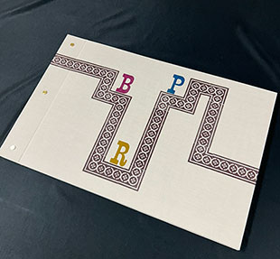
Designed by Kelsey Reiman Dimensions: 13 1/8” x 20”; 106 pages. Letterpress printed on Mohawk Superfine Paper in soft white. Fonts hand-set in 14-point Spartan Medium Italic. Bound in cloth over boards with metal post binding. Hand numbered. Black Rock Press: “This book documents wood type from the Barbara Anne Kelly Historic Wood Type and Printer’s Cuts Collection at Black Rock Press, which includes over 200 typefaces and 100 unique fonts ranging in size from 3 line to 100 line, and includes type from the United States and England.” Colophon: “The Barbara Anne Kelly Historic Wood Type and Printer’s Cuts Collection was purchased for the Black Rock Press (BRP) by Inge Bruggeman in 2018. … “The production of this specimen book began in January 2021, with BRP faculty, students cataloging and identifying type by comparing impressions with specimens in ‘American Wood type:1828 – 1900” by Rob Roy Kelly, “Hamilton’s Specimens pf Wood Type Faces” and various digitized wood type catalogs available through the University of Wisconsin, Madison Libraries Silver Buckle Collection and the Rob Roy Kelly American Wood Type Collection of the University of Texas, Austin. Wood type is often difficult to identify because manufacturers frequently pirated designs. If a manufacturer’s stamp was found on the type, the name specific to that manufacturer was used. In this book, both the font name and the number associated with it by Hamilton were used. The fonts were organized into groups using the categories named by Rob Roy Kelly and David Shields: Roman, Antique, Gothic, and Script.” |
|
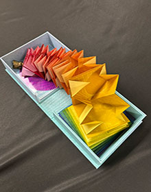
Snap to Grid Clamshell Box: 6" x 5.75" x 2" containing components of project – map fold book, plate with spiral design, lid with round design and a plexi round attached over which the plate fits. Components include Turkish spiraling map fold accordion book (5" x 5" x 2"). Pressure printing. Designed in Adobe illustrator. Letterpress printed on a Vandercook Universal I on green Kitakata paper. 5.25 x 5.25” plexi with wheel print. Colophon printed on bottom interior box. Hand numbered. Black Rock Press: “’Snap to Grid’ is an artist book and animation by 2021-2023 Black Rock Press Fellow Kelsey Reiman. This publication, designed by Reiman and printed at Black Rock Press at the University of Nevada, Reno, is the fourth artist book of the biennial Parley Project. “’Snap to Grid’ … an accordion book with Turkish map folds nested into the valleys of the structure. The animation follows the colors as they change throughout the spectrum. Every Turkish map fold is a unique print in the edition and corresponds to a single frame in the 1200 frame 100 second animation. The first book in the edition contains the first frame in each color within the animation and the edition continues on in that fashion. The animation was made by incrementally changing the pressure printing plates after every print, so that when all the prints were photographed and digitally sequenced, they created the illusion of continuous motion. This book employs systems, both real and arbitrary, to explore the relationship between digital and an analog processes, analytical and playful approaches and decorative and functional aesthetics.” The top of the box becomes like a kaleidoscope when the viewer places the plate on top of the lid apparatus. Once the plate is turned the animation begins. A lovely interactive piece. |
|
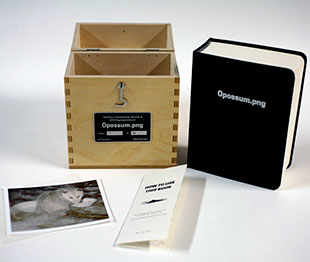
Opossum.png 5.1875 x 6.5 x 2.375"; 968 pages. Housed in a handmade birch-ply box with accompanying digital print of opossum photo and “How to use this book” pamphlet. Black Rock Press: "’Opossum.png’ is a book and website created by artist Jeff Thompson that makes physical a single, low-resolution image. In early 1995, a group of strangers assembled online to develop what would become the PNG file format. One of the first images to be encoded in this new format was a pixelated photograph of an opossum, taken by programmer and PNG contributor Glenn Randers-Pehrson. The entire contents of this photograph are presented in a 968-page book, listed in the various formats required to be read by a computer. It also includes a wooden storage case and a printed copy of Randers-Pehrson's photograph. A website accompanies the project, containing a full set of annotations for the file, delving into the technical workings of the PNG format and the people who made it. https://jeffreythompson.org/opossum.png/ ." Jeffreythompson.org/opossu.png: “In 1994, the internet was in an early heyday; AOL had about three million active users with lots of other folks participating in other online platforms. The internet was shifting from primarily a text-based experience to one full of media, in particular GIFs, an image format introduced by CompuServe in the late 1980s. But, though popular, the GIF format was quietly embroiled in a year-long legal battle over the data compression technique it used called LZW. Three days before Christmas of 1994, a deal was announced where CompuServe would charge royalties to any software that supported GIFs. This created a huge stir among online communities, notably the comp.graphics newsgroup, where the Portable Network Graphics (PNG) format would later have its start. “But amid days of complaints and arguments, on 3 January 1995 Thomas Boutwell made a post suggesting that a new image file format be created, one that used technologies that were free of any patents. JPG had existed at this time for a couple of years, but its compression was lossy, meaning the image could not be reconstructed at full resolution the way GIF or TIFF (another popular format at the time) allowed. “After Boutell’s original post, a “group of strangers” formed, working entirely online and by consensus … Only a day after the first post, a working draft of the file format was published by Boutell; this version of PNG looks very much like the format we have today. … “This website, part of a larger project in collaboration with Black Rock Press is an annotated version of the image above [Opossum.png]. Taken by long-time PNG contributor Glenn Randers-Pehrson, it features an opossum aptly named PNG who frequented his family’s deck in search of cat food. This image is one of the so-called ‘paleo PNGs,’ considered the first to be successfully encoded into this new image file format and uploaded to the internet.” |
|
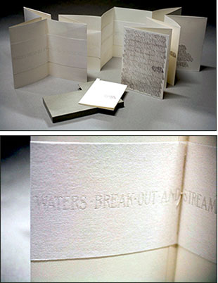
Shall 6.5 x 9"; 8 folds. Double sided accordion structure. Letterpress printed from photopolymer plates on Zerkell book vellum paper. Collaboratively designed by Jared Stanley and AB Gorham, in consultation with Inge Bruggeman. Sewn binding with stiff paper covered boards. In slip case with pocket on back board for colophon pamphlet. Signed by Stanley. Black Rock Press: "SHALL is an accordion bound artist book and poem made from rubbings of the Newlands Monument in Newlands Circle in Reno, Nevada. The book’s author, Jared Stanley, is an assistant professor of English at the University of Nevada, Reno." Double Scoop, Arts in Nevada "Scrambled words … ", Jose Glassberg on January 7, 2020: "Monuments are old stomping grounds for artists. Whether they are erected as straightforward commissions or co-opted to say something cheeky about authority, the practice of lending physical permanence to transitional power will always be a part of the artistic landscape as long as it is a part of the political one. 'Who is in charge here?' is a question we will never get tired of asking. "I must have passed by it [columned monument at the entrance of my neighborhood in honor of Francis Griffith Newlands, a former Nevada Senator]. a hundred times, but never gave it a second thought until a few months ago when Jared Stanley came out with Shall, his latest art/poetry book, whose subject is the Newlands object. "In it, Stanley scrambles the original text on the face of the monument—a riff of Isaiah 35—to rethink both the intended legacy of the senator (he helped create the U.S. Bureau of Land Reclamation, which brought industrial agriculture to the Western United States) and the actual legacy of the senator (he pioneered a model of racist land development that would eventually lead to the practice of red-lining in African American communities). "Stanley’s re-ordered text (which he puts together in a series of bound paper rubbings) retains the cadence of religious command while perverting Newlands’ version of domesticated wilderness to 'bewilderness forever.' Newlands’ dream of greening the desert is replaced by an anarchic dream of the desert while 'shall' is stripped of its imperative and never replaced. Or maybe it’s just reinstated with a lack of intention, a void where only uncertainty can stand next to words like 'forever.' "It seems fitting, too, that the disassembly of this monument is temporary—printed on paper instead of etched in stone." |
|
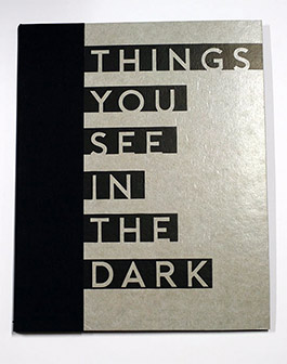
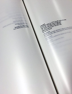
Things You See in the Dark 11.5 x 14.5"; 22 leaves. Printed on glassine. Bound in cloth over boards. Front board partial cover in glassine with cut-out title letters. Paper four-flap portfolio envelope on back pastedown. Laid in are 6.75" vinyl soundtrack and pamphlet (6 x 9", 20 pages including wraps; stapled; text in Spanish and English). Signed and numbered by Cardenas. Black Rock Press: "Things You See in the Dark, a Parley Project created by the 2016-2018 Black Rock Press Redfield Fellow, Lauren Cardenas, is a collaboration with Daniel Enrique Perez, an Associate Professor of Chicanx and Latinx studies in the Department of World Languages and Literatures at University of Nevada, Reno and David Kirkland, a DJ based out of St. Louis. The Parley Project is a biennial interdisciplinary book art project that fosters research and conversation across the UNR campus and involves BRP students, staff, and faculty in its production. "Things You See in the Dark is a visual, tactile, and auditory experience that pays homage to the uncertainties one might experience in the dark. Composed of a suite of prints and poems, along with a vinyl soundtrack, this artist book invites the viewer to slow down while meditating on the elusive nature of the dark." Lauren Cardenas, artist's statement: "Things You See in the Dark is an homage to the quiet subtle moments found in a veiled aperture. This tranquil space gives permission for close encounters with faint whispers and soft embraces that may illuminate the warmth of one's inner being (pneuma). … In the dark I find solace, believing it is a space where one may become acquainted with the unknown." Lauren Cardenas is a Texas native and studio artist who focuses on print media. She is an Assistant Professor in Printmaking the University of Mississippi. Daniel Enrique Perez, director of the Core Humanities program and a faculty associate of the Gender, Race, and Identity program, at UNR: "I hope the poems I wrote for this collection evoke the full range of sentiments I felt when immersed in Lauren's work. I was interested in capturing that tension between intimacy and distance. I wanted readers to have some of the revelations I had when delving into the images and making discoveries about the past that helped me understand the present. I also wanted to leave readers with a sense of hope – that glimmer of light that is always present and leads the way to alternate spaces, other realms, and other dark spaces." |
|
Selected Durations 7.25 x 13.5" box containing two items: "Selected Durations" and production notes. Letterpress printed from photopolymer plates on Yuo Synthetic Paper and Neenah Touché. Numbered. "Selected Durations": 25 leaves plus wraps; rubberized snap binding. Colophon: 5.5 x 13"; 5 leaves; covers in black; bound with ring hole upper left corner. Laid in tray box covered with black paper and green cloth. Black Rock Press: "'Selected Durations' by David Abel is simultaneously a poem and a score for performance that captures, analyzes, quantifies, and archives time. The kinesthetic and material qualities of this artist's book embed Abel's text in multiple layers of meaning, requiring the reader to perform the experience of the passage of time, which ticks away with each turn of the page. "The publication of 'Selected Durations' was prompted by the author's performance of the piece in a BFA Seminar in the Department of Art at the University of Nevada, Reno, taught by Inge Bruggeman. Experiencing the pace and the compression of time in the reading led Inge to propose that the text be editioned. Beginning with a prototype originally created by artist Katherine Kuehn, the Black Rock Press reimagined the work, bringing it to life in the hands of readers." David Abel, Author's Note: "The text for the piece was taken from a reference book in my personal library: 'Durations: An Encyclopedia of How Long Things Take' compiled by Stuart A. Sandow, Chrissie Bamber, and J. William Rious (Times Books, 1977). Selected entries were lightly edited and then the list winnowed to the requisite overall length. In addition to the vividness, incongruity, mystery, and sometimes slapstick effects of the facts taken out of context (and the way in which this seemingly random sample nonetheless served to characterize a culture), I was intrigued by additional layers of temporality embedded in the text – the likelihood, for example, that many of the statistics must have already been out of date by the time I cobbled together the score." |
|
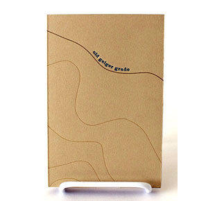
| Old Geiger Grade By Jaime Shafer Reno, Nevada: Black Rock Press, 2016. Edition of 50. 6.75 x 4.375"; 16 pages including covers. Letterpress printed from handset metal type and photopolymer plates on Rives BFK. The typefaces that appear in the book are Craw Clarendon and Clarendon. The book is handbound in a drum leaf structure and presented in a paper wrapper and slipcase. Laser cut on an Epilog Helix 24 Laser Cutter and handcut by the artist. Signed and numbered by the artist on the colophon. Jamie Shafer: "Created as part of my experience as the Black Rock Press Redfield Fellow in Book Arts at the University of Nevada, Reno, Old Geiger Grade is the first book produced by the Black Rock Press for the Parley Project. The Parley Project is a biannual interdisciplinary book art project that engages other entities within the university in conversation with the Black Rock Press. It was influenced by the W.M. Keck Museum at the University of Nevada, Reno—the second oldest museum in the state. Special thanks to the staff and students at UNR who assisted with production: Inge Bruggeman, Amy Thompson, Amaris Martin, Judith Rodby, and Su Tran. "Old Geiger Grade was inspired by Geiger Grade Road and the history of the Comstock. It places readers in the steep, dangerous terrain of the 1860s as they travel to Virginia City where they hope their fortunes might be found." nevadalandtrust.org: "Next time you’re headed up to Virginia City from Reno on Geiger Grade, NV 341, check out the Nevada State Historical Marker just before the road flattens out in the Highlands. The sign tells of the Old Geiger Grade (‘In Canyon Below’) constructed by Davison Geiger and John Tilton in 1862 to link Virginia City’s Comstock Lode to the Truckee Meadows." $265 (Last Copy) |
|
| Black Rock Press SOLD / Out of Print Titles: | |
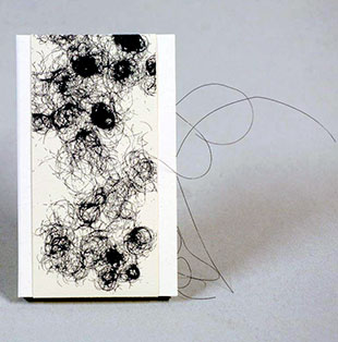
Don't Cut Your Hair It's Beautiful 4.6875in x 8in x 0.5in.; 72 pages. Offset printing on Ultra Green Film (text pages). Letterpress printed with hand set lead type (News Gothic Bold & Century Bold Italic). Boards bound in Hollanders starched linen book cloth (Natural/Kennett). Bugra Antique Rose (paste downs). Three sewn pamphlets laid in cloth covered boards. Pamphlets binding sewn with monofilament. Belly band of cream. Signed by Morgado and numbered. Kellee Morgado: "'Don’t Cut Your Hair It’s Beautiful' disrupts and explores the relationship between hair that is considered valuable and hair that must be hidden, removed, and made invisible. The book includes contributions from twelve creatives in particular, but not limited to, those working with hair as a subject or material. These individuals were invited to respond to one of several prompts or to generate their own response about hair on the body. They could also choose to include an image, either found or made. These twelve writings provide thoughts and experiences surrounding hair, multiple points of access, and themes connected to hair on the body including: shame, resistance, and identity. "Hair, from head to toe, is a mutable mode of self-expression and identity. Hair on the head and body is intimately woven through feminism, gender, sexuality, spirituality, race, religion, culture, and resistance. It is my hope that more people come to celebrate their hair, empower others’ choice, and that the expression of body hair on female aligned individuals will be just as normal as its removal; free of shame and judgement. "'Don’t Cut Your Hair It’s Beautiful' is a set of interactive books that asks the reader to fold and unfold pages to construct or reveal images and text. Through the use of fragmented images, readers are encouraged to explore multiple possibilities of sequencing and arrangement where covers pair with center spreads to construct complete images." Twelve participants: AB Gorham, Alisa Banks, Frances Melhop, Althea Murphy-Price, Rebecca Drolen, Jayoung Yoon, Kellee Morgado, Kate Kretz, Suzanne Gold, Kat Howard, Sarah Scarr, and Judith Rodby. Artists’ Books Unshelved / Gorgeous or Grotesque?: “Is it gorgeous or grotesque? In this episode … we look at two interactive artist’s books that question our intimate assumptions and responses to hair.” |
|
Page last update: 04.25.2025
Home | About Us | Contact Us | New Arrivals | Fine Press & Artists' Books | Broadsides |Resource Books | Order/Inquiry
Copyright © 2023 Vamp & Tramp, Booksellers, LLC. All rights reserved.
